YouTube Analytics is part of the suite of products that creators use to manage and grow their channels. The team was redesigning it from scratch to replace an old product that had grown into an explosion of data that intimidated all but the most advanced users. Our mission was to provide a simplified analytics overview, powerful advanced features, and intelligent insights.
During my two years on the team, our product team aspired to serve both novice and advanced users equally.
Case study 1: Comparisons
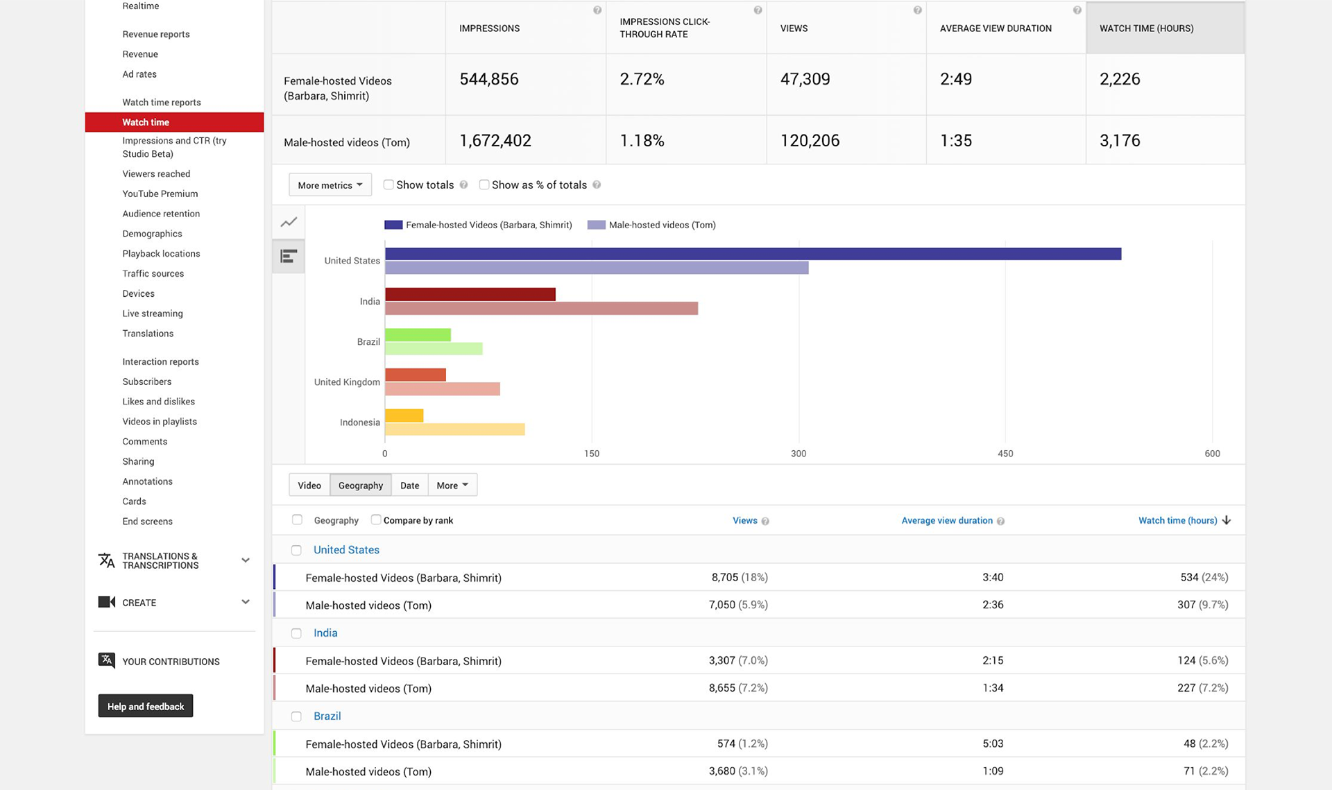
The old analytics allowed creators to compare anything to anything — this year vs. last year, video A vs. video B, livestreams vs. vlogs, etc. But while powerful, it offered no hints on which comparisons might be useful, and the results were hard to read. User research showed that only media companies and our most advanced users knew how to extract useful insights.
We were slated to simply migrate comparisons to the new product, but I felt we could use the opportunity to build a clearer, more helpful tool for everyone.
Users needed to know exactly what to input to get something useful.
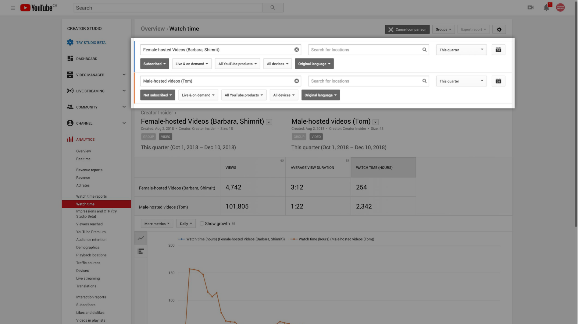
The comparison results were hard to parse, especially in the table.
User research
I planned and conducted my own research with our product specialists to understand their needs in diagnosing creator issues (and by extension, creator needs as well). This validated the core of my design, and also yielded two core needs:
Common configurations. Total flexibility can be useful, but most use cases involve a small, specific set of comparisons (e.g. year over year).
Bar charts. We’d been focussing on line charts, but participants clearly wanted to see comparisons as bars. This pushed the team to prioritize this feature on the roadmap.
Redesign
The video below shows the final experience in detail, comparing a channel's performance to itself the previous year. There were a great number of considerations in making sure it was compatible with all configurations of metrics and breakdowns, and so that it connected seamlessly to the other advanced tools. Three features in particular are worth calling out here:
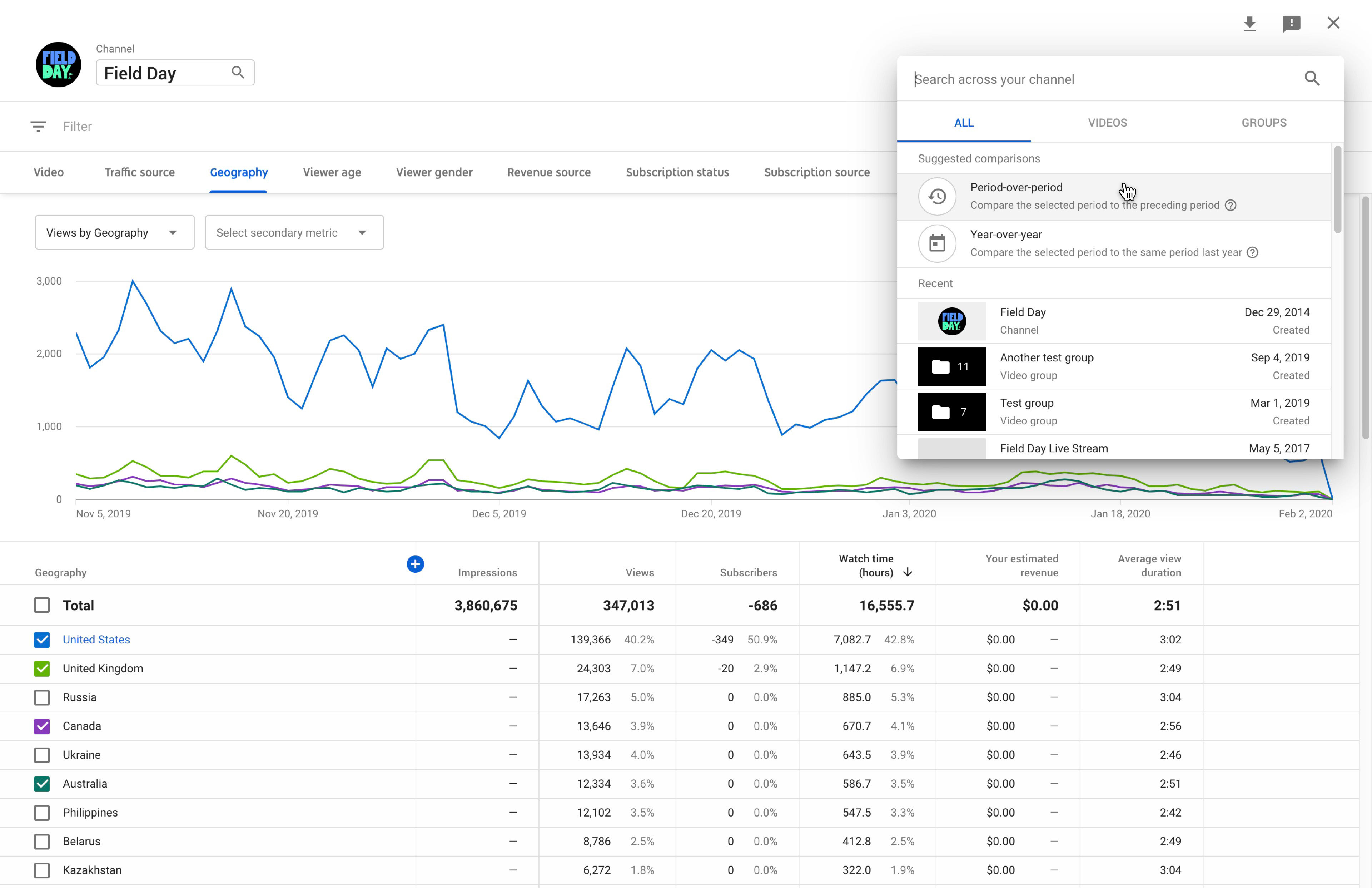
Suggested comparisons. I built the common configurations that served as standard use cases directly into the entry point as shortcuts. This way users could see the most useful comparisons with only two clicks. And if users weren’t familiar with the tool at all, this provided a useful place to start instead of an intimidating blank slate.
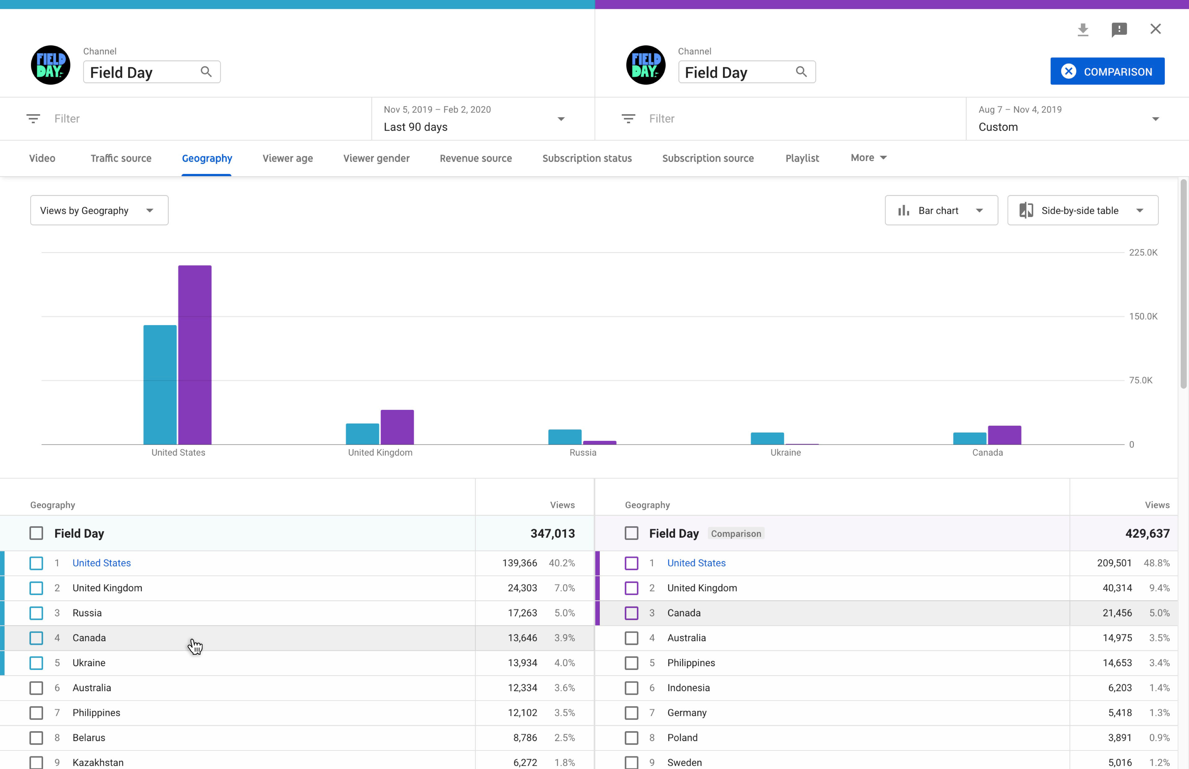
Split table. I designed a completely new type of table for comparisons which clearly showed item A on the left and item B on the right. This was echoed in the header, including a split-color bar that dropped from the top of the screen. In this intuitive design, I was able to introduce a number of features that proved very popular with both novice and advanced users.
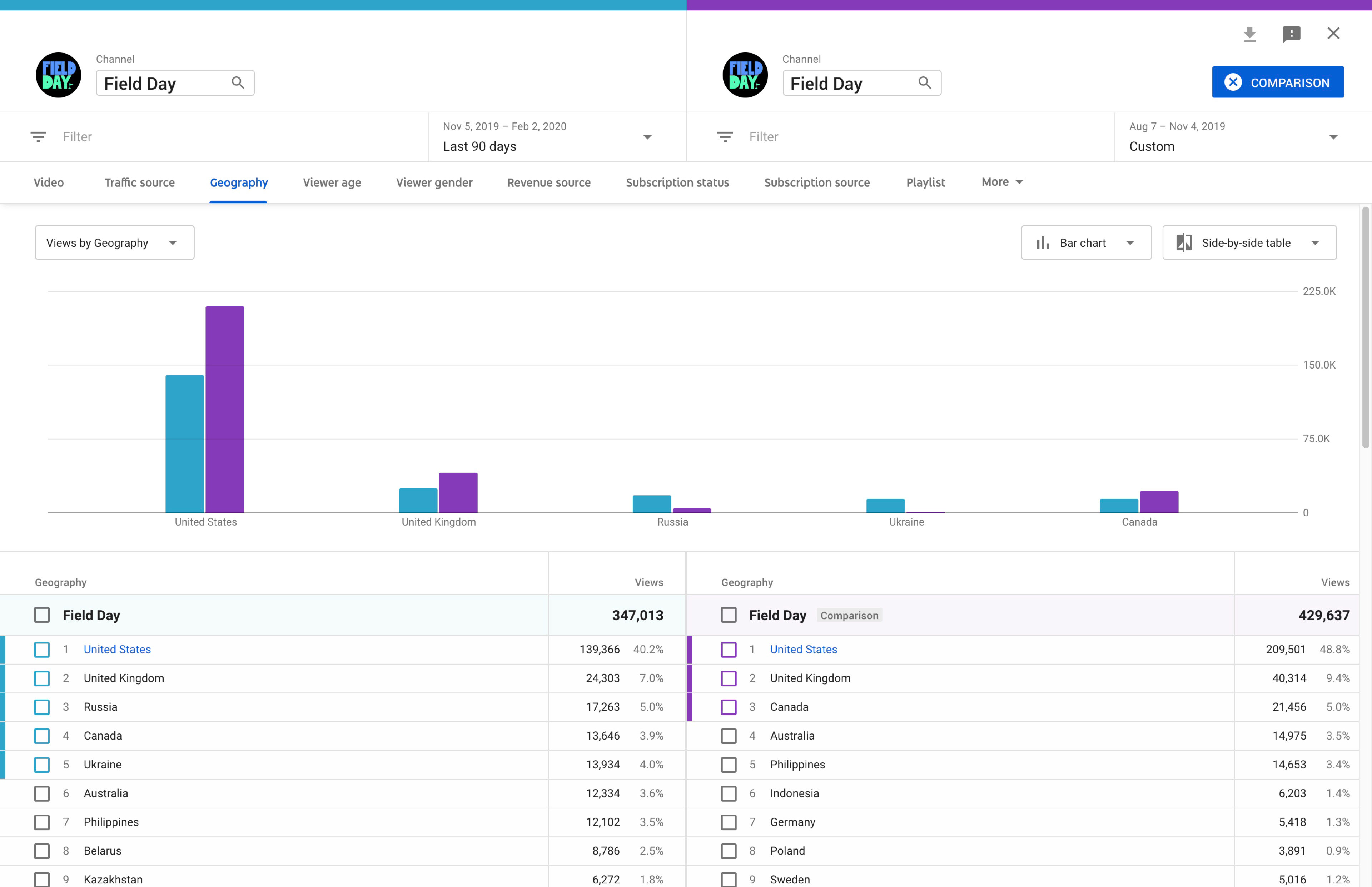
Hover to compare. Hovering over a cell on the left highlights the equivalent cell on the right. In the date comparison shown, you can easily see how different countries ranked this year vs. last year.
Case study 2: HEADLINES
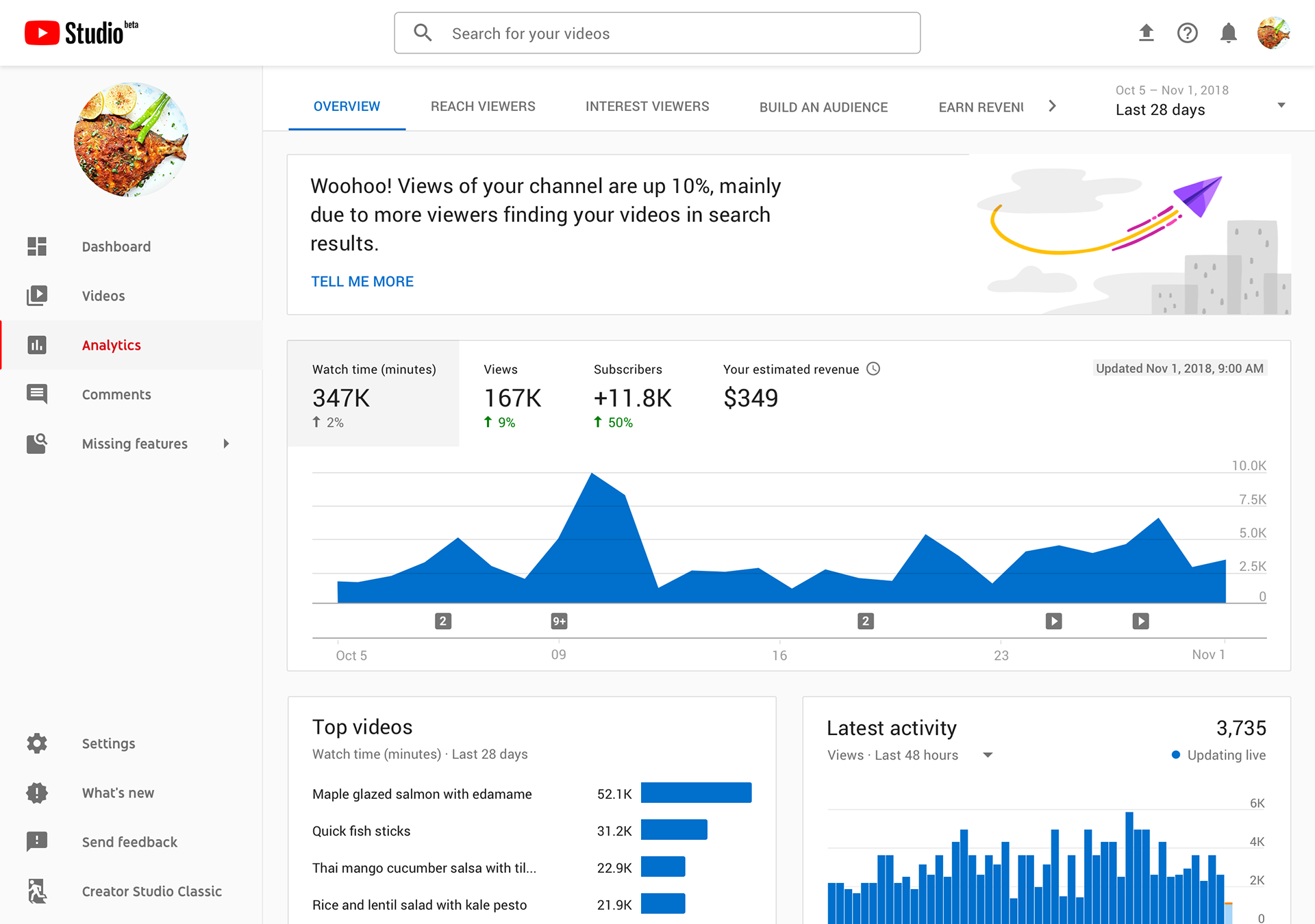
Part of our mission in redesigning YouTube Analytics was to advise creators on how to make their channel successful. In order to do this successfully, we needed to go beyond charts and tables, and start to provide opinions and analysis. This was a particularly strong need for novice creators who had little time to analyze their data.
Early explorations
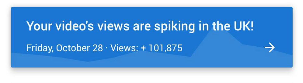
The first designs were around anomaly detection — algorithmically finding spikes and dips, and presenting them to creators in plain language. But the feedback from users was less positive than the team had hoped, because being able to see a spike or dip didn't help them to understand why it happened in the first place.
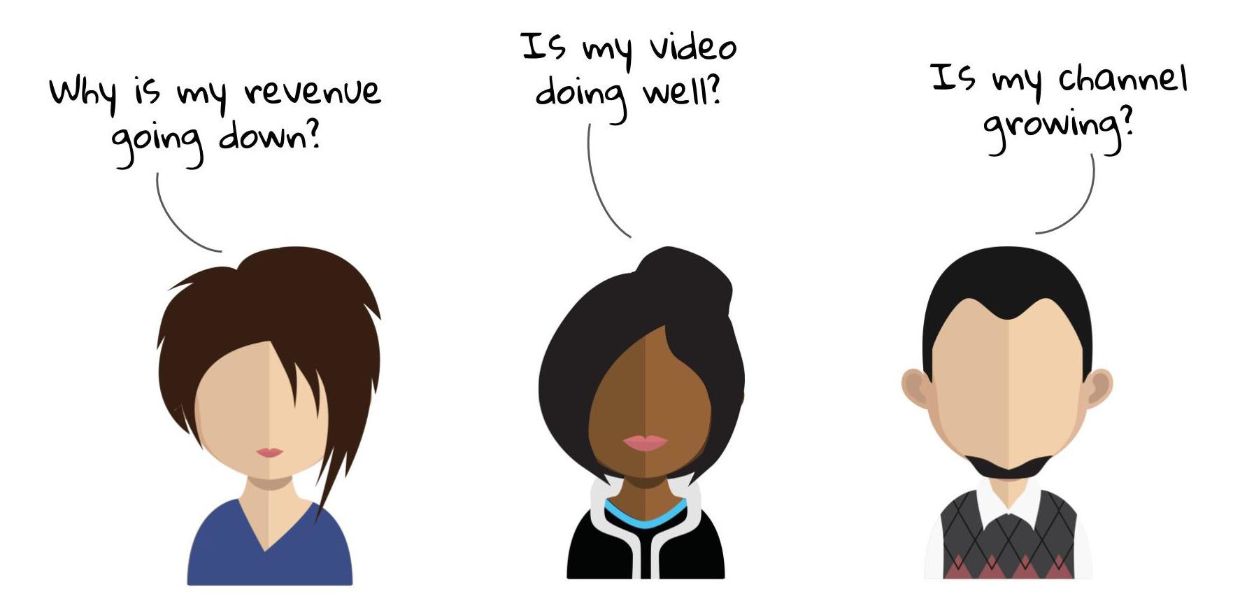
We'd long known from user research that creators came to analytics with many of the same recurring questions:
So in a new approach, the intelligence team created ingenious methods for using a constellation of data points to automatically answer these questions rather than simply highlighting anomalous trends.
But in testing these analyses with creators, they proved almost as overwhelming as the original charts and graphs. We needed to design a way to present this sophisticated analysis in a digestible way.
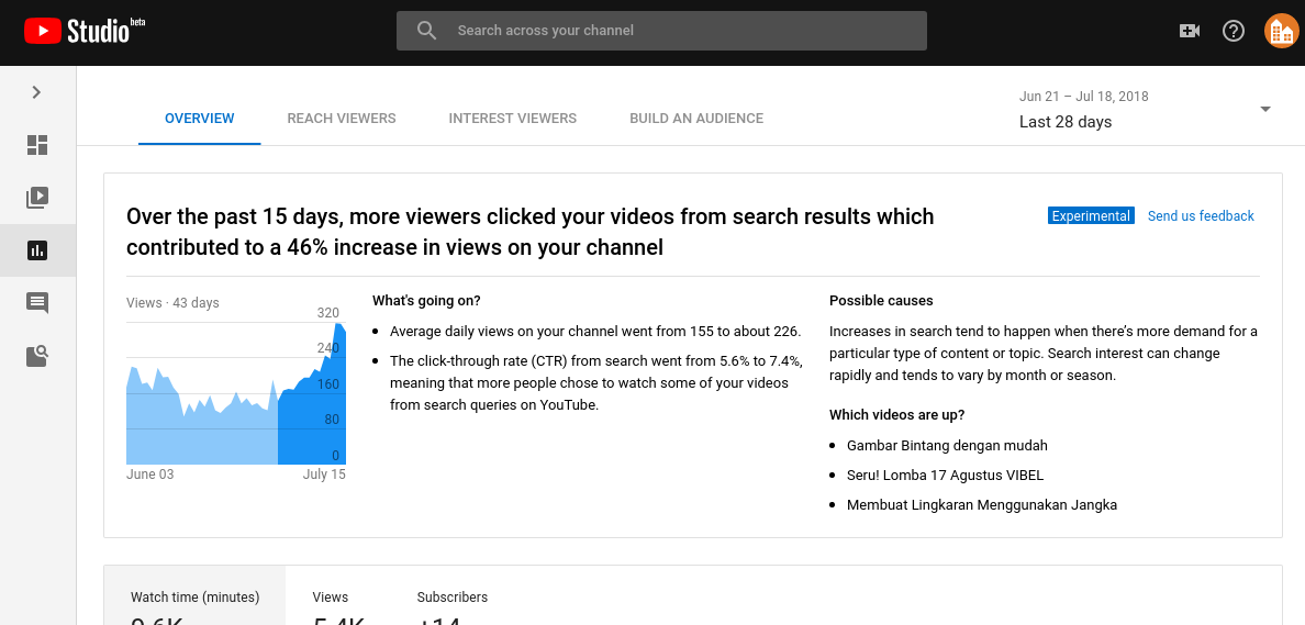
An early prototype that we tested with creators. The analysis was almost as overwhelming as just reading the charts.
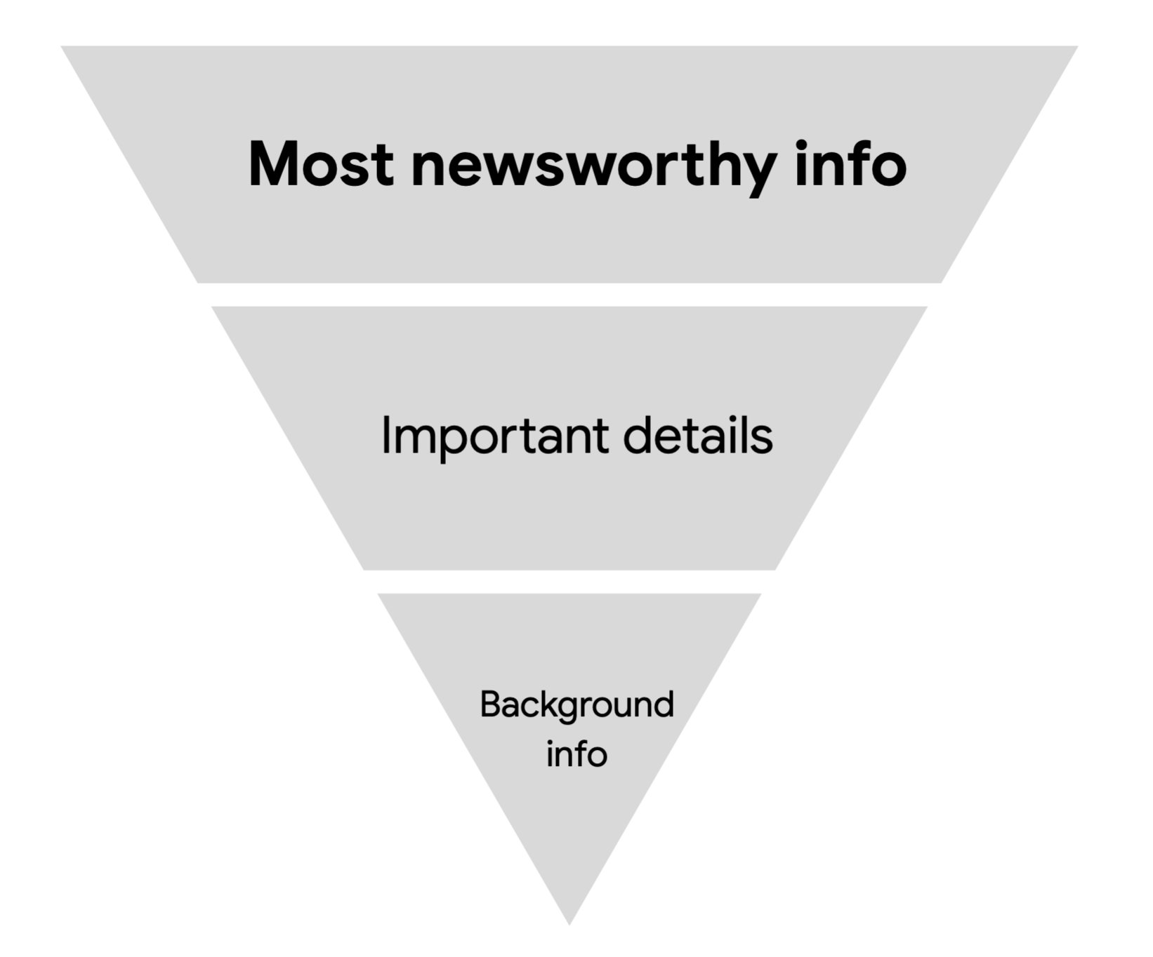
INVERTED PYRAMID
We borrowed a concept from journalism which is designed to convey the most important information first, leaving the details for readers who remained interested. Using this model, we wordsmithed each piece of analysis to start with a headline, follow with actionable points, and conclude with the underlying data.
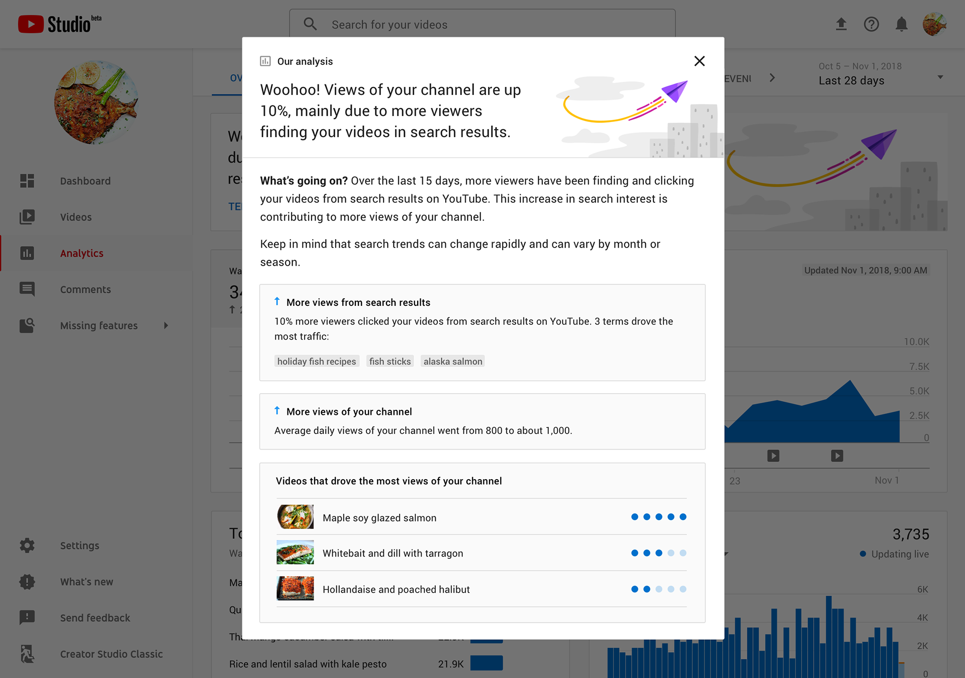
"This is the most useful feature since monetization."
After releasing our new design, feedback from creators was overwhelmingly positive. Accustomed to impenetrable walls of data, novice creators were delighted at a friendly tone which proactively answered some of their most burning questions.
But the proof was in the numbers. YouTube Studio was still in beta, and for those users who had access to our headlines, their usage of the entire platform increased significantly.